First Chapter

I was tasked with creating First Chapters identity, giving me a blank canvas to construct a brand to match the premium nature of their work.
Brand Identity
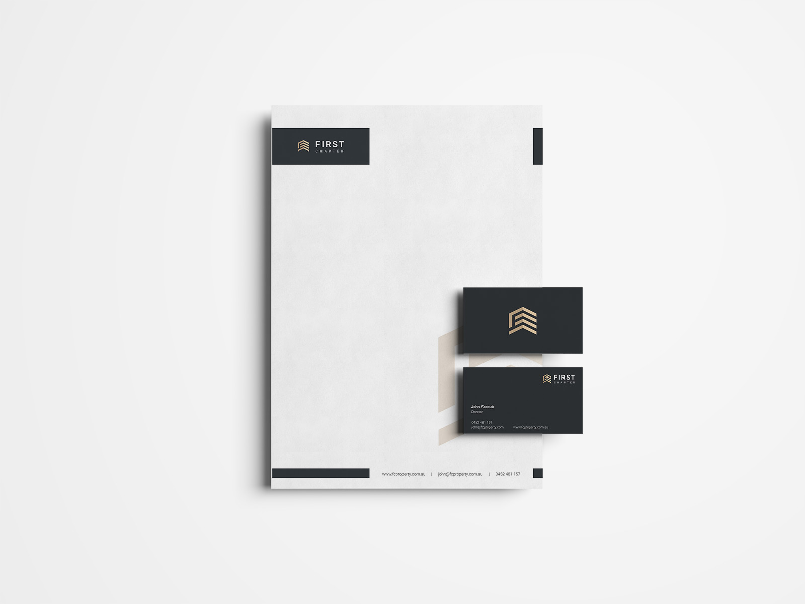
First Chapters new identity includes font & colour styles to match the premium standard of work their work. I incorperated these styles into the logo & brand guidelines.
Web Design & Development
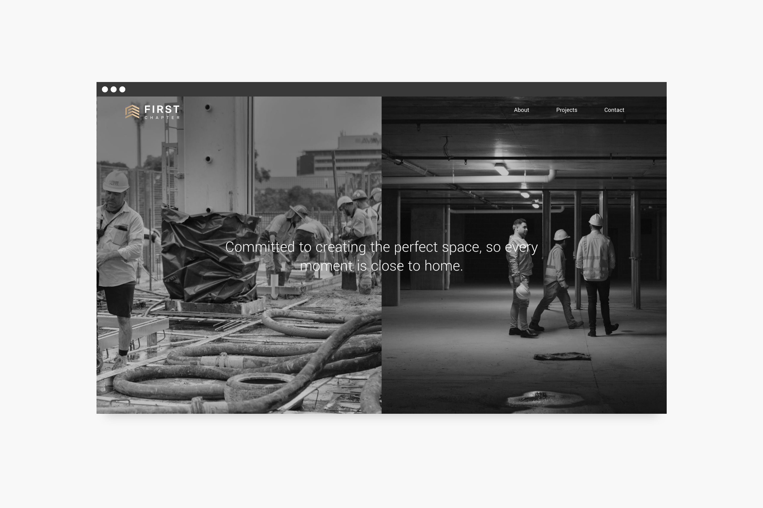
The design of the website follows suit on the brand guidelines I created. Going with a minimalist look to support the product imagery provided.
Copywrite
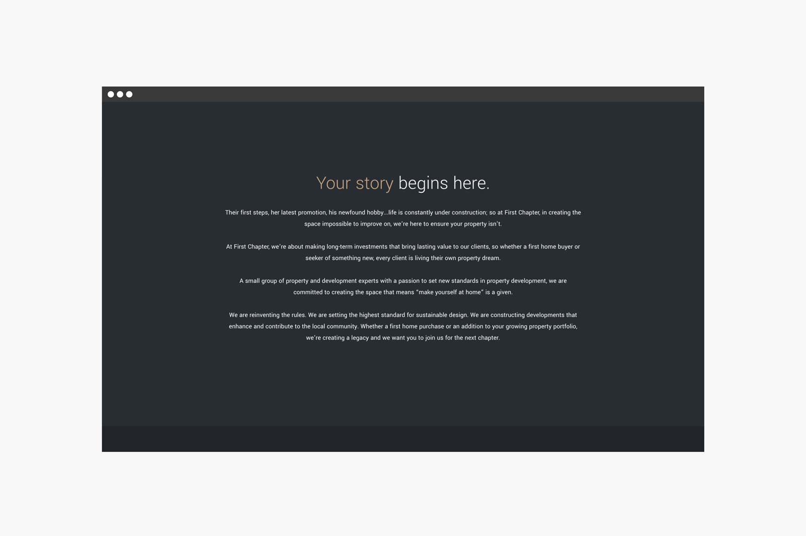
My copy for First Chapter delves deeper into their product, exploring ideas of story writing & new beginings.
First Chapter - Your story begins here.
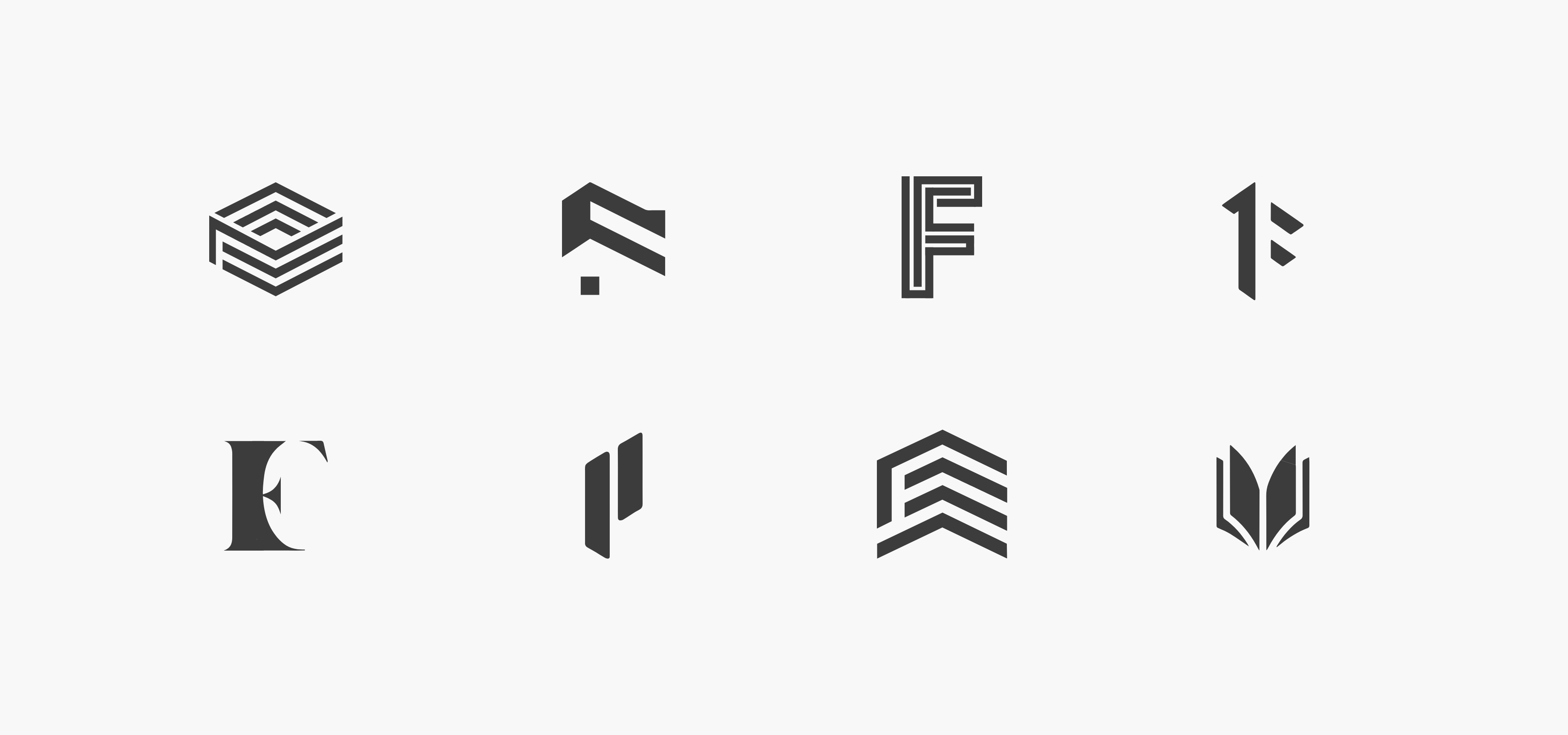
I explored ideas of books, buildings & construction for the identity of First Chapter (logo concepts above). Ultimately, I settled for all 3 - combining each element in different perspective views. Do you see an open book or the face of a building?

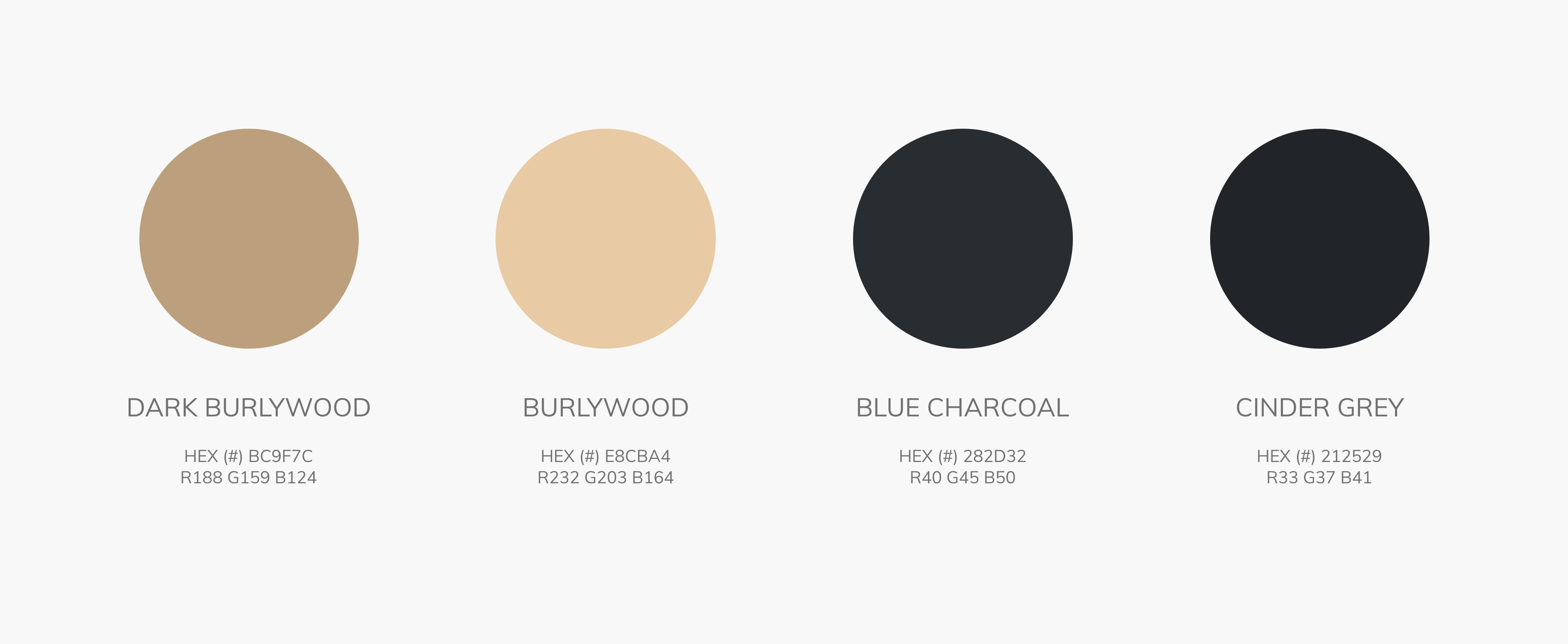
The challenge was how to help First Chapter become an easily recognisable brand. I created a wider digital colour palette to support the minimalist design of the website.
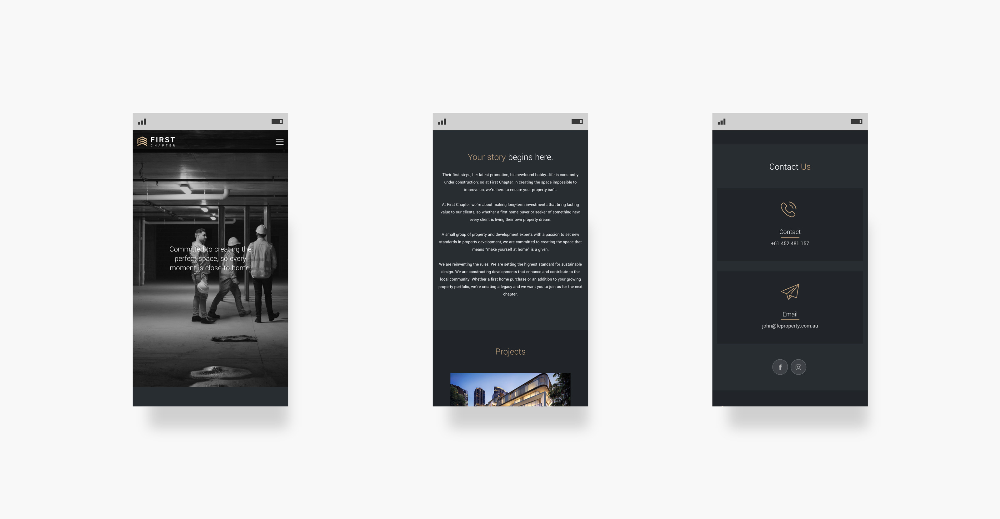
I designed the site with the user in mind. The minimalist look of the site allows the photography to shine, showing the user the premium product that First Chapter delivers.
